
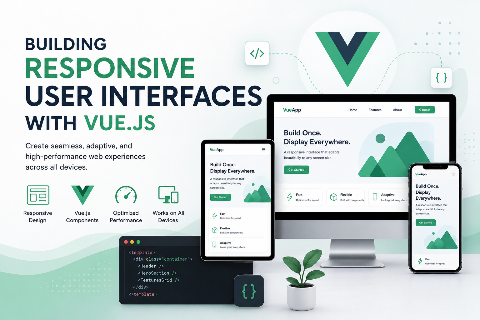
In today’s digital landscape, users access web applications through a wide variety of devices, including desktops, laptops, tablets, and smartphones. Each device comes with different screen sizes, resolutions, and interaction methods. As a result, creating user interfaces that adapt seamlessly across these devices has become a fundamental requirement in modern web development.
One of the most effective technologies for building responsive and dynamic user interfaces is Vue.js. Known for its simplicity, flexibility, and performance, Vue.js enables developers to create interactive applications that provide a consistent user experience regardless of screen size or device type.
Responsive user interfaces are no longer just a design preference—they are a necessity. Users expect applications to function smoothly and display correctly whether they are browsing on a large desktop monitor or a mobile phone. Vue.js provides the tools and architecture needed to meet these expectations efficiently.
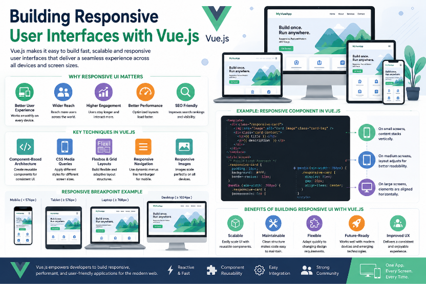
Understanding Responsive User Interfaces
A responsive user interface is a design approach that allows web applications to automatically adjust their layout, content, and functionality based on the user’s screen size and device characteristics.
The goal of responsive design is to ensure that users can easily navigate and interact with an application without needing to zoom, scroll excessively, or struggle with poorly aligned content. Responsive interfaces improve usability, readability, and overall user satisfaction.
When combined with modern CSS techniques and Vue.js components, responsive design becomes easier to implement and maintain throughout the development process.
Why Vue.js is Well-Suited for Responsive Design
Vue.js follows a component-based architecture, allowing developers to break user interfaces into smaller, reusable components. Each component can be designed independently while still working together as part of a larger application.
This modular approach makes it easier to create layouts that adapt to different screen sizes. Developers can reuse components across multiple pages and adjust their appearance based on device requirements.
Vue.js also provides reactive data binding, which allows the user interface to update automatically whenever data changes. This responsiveness extends beyond screen size and contributes to a more dynamic and interactive user experience.
Improved User Experience Across Devices
One of the biggest benefits of building responsive interfaces with Vue.js is the ability to deliver a consistent experience across multiple devices.
Users expect websites and applications to behave similarly regardless of where they access them. Responsive layouts ensure that navigation menus, forms, images, and content sections remain accessible and easy to use.
For example, a navigation menu that appears horizontally on desktop screens can automatically transform into a mobile-friendly hamburger menu on smaller devices. This adaptability improves usability and helps users interact with the application more efficiently.
Better Performance and Faster Loading
Performance plays a significant role in user satisfaction. Slow-loading applications often lead to increased bounce rates and reduced engagement.
Vue.js is lightweight and optimized for performance, making it an excellent choice for responsive applications. Its Virtual DOM efficiently updates only the necessary parts of the page rather than re-rendering the entire interface.
By combining Vue.js with responsive design principles, developers can create applications that load quickly and perform smoothly across a variety of devices and network conditions.
Enhanced Maintainability Through Reusable Components
Responsive applications often require multiple interface elements that appear throughout the website. Vue.js components allow developers to create reusable building blocks such as navigation bars, cards, buttons, and forms.
Instead of duplicating code across different pages, developers can reuse components while maintaining a consistent design and functionality.
This approach simplifies maintenance and allows updates to be applied across the entire application from a single source, reducing development effort and minimizing errors.
Easier Adaptation to Changing Requirements
Modern applications frequently evolve as user expectations and business requirements change. Responsive design built with Vue.js provides flexibility for future updates and improvements.
Developers can easily modify individual components, update layouts, or introduce new features without restructuring the entire application. This adaptability helps organizations respond quickly to new requirements while maintaining a high-quality user experience.
As projects grow, the ability to make changes efficiently becomes increasingly valuable.
Common Techniques for Responsive Vue.js Development
Building responsive user interfaces with Vue.js typically involves combining Vue components with modern CSS techniques.
Some commonly used techniques include:
- CSS Media Queries for different screen sizes.
- Flexible layouts using Flexbox.
- Responsive grid systems.
- Mobile-first design approaches.
- Dynamic component rendering.
- Responsive navigation menus.
- Adaptive images and media content.
- Device-specific styling and breakpoints.
These techniques help ensure that applications remain functional and visually appealing across all devices.
Increased Accessibility and Inclusivity
Responsive design also contributes to accessibility by making applications easier to use for a wider range of users.
Features such as scalable text, touch-friendly buttons, proper spacing, and responsive layouts improve usability for people with different abilities and devices.
When accessibility and responsiveness are combined, applications become more inclusive and provide a better experience for all users.
Challenges of Building Responsive User Interfaces
Although Vue.js simplifies responsive development, there are still challenges developers may encounter.
Some common challenges include:
- Supporting a wide variety of screen sizes.
- Managing complex responsive layouts.
- Testing across multiple devices and browsers.
- Optimizing performance for mobile users.
- Maintaining design consistency across breakpoints.
Despite these challenges, Vue.js provides powerful tools and flexibility that make responsive development more manageable and efficient.
Conclusion
Building responsive user interfaces with Vue.js is an essential practice for modern web development. By combining Vue.js’s component-based architecture, reactive data handling, and performance optimization with responsive design principles, developers can create applications that provide exceptional user experiences across all devices.
Responsive Vue.js applications offer improved usability, better performance, easier maintenance, and greater flexibility for future growth. As mobile usage continues to increase and users expect seamless experiences across devices, responsive design remains a critical factor in the success of modern web applications. Vue.js provides developers with the tools needed to meet these expectations and build interfaces that are both functional and user-friendly.
