
Introduction
Building a modern application is no longer only about configuring the business process. The user interface also plays an important role in how easily people can complete their work.
This is where the Pega Constellation UI Designer becomes useful.
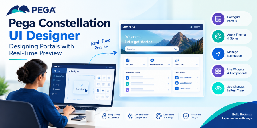
In Pega Platform ’26, the UI Designer is part of the Constellation authoring experience and helps application builders configure portal content, themes, and navigation while seeing design changes in real time. Pega’s current UI authoring module also covers Portals, Landing Pages, Views, Widgets, Themes, and Styles. (Pega Academy)
Instead of treating UI configuration as a completely separate development activity, Constellation brings more of the design experience directly into the application-building workflow.
Let’s look at what that means in practice.
What Is Pega Constellation UI Designer?
The UI Designer is a visual authoring experience for designing parts of a Constellation application’s user experience.
It helps application builders configure areas such as:
- Portal content
- Navigation
- Themes
- Styling
- Landing-page content
- Visual presentation
Pega describes the UI Designer as providing a drag-and-drop experience, out-of-the-box design selections, and an AI assistant for in-context design configuration. It also provides real-time visualization while changes are being made. (Pega Academy)
This makes the process more visual than traditional UI configuration.
Instead of repeatedly changing configuration and then checking the runtime separately, developers can see the effect of many design decisions while authoring.
Why Real-Time Preview Matters
One of the practical benefits of UI Designer is immediate visual feedback.
Imagine that you are configuring a portal and want to change:
- Navigation items
- Portal layout
- Theme settings
- Colors
- Typography
- Landing-page content
With a traditional development workflow, you may need to make a change, save it, open the application, navigate to the appropriate screen, and then determine whether the result looks correct.
Real-time visualization shortens that feedback loop.
Configure
↓
Preview
↓
Adjust
↓
Preview again
↓
Finalize
This is particularly useful when working on enterprise applications where small UI changes can affect the overall experience.
UI Designer and Constellation Portals
Constellation applications use a portal-based user experience.
Pega’s current Constellation training specifically covers Portals and Landing Pages, including the configuration of portal experiences and reusable UI elements. (Pega Academy)
A portal provides the environment through which users access their work.
For example:
Portal
│
├── Navigation
│
├── Landing Page
│ ├── Widget
│ ├── Widget
│ └── View
│
└── Case / Data Experience
The exact portal experience depends on the application’s requirements and the user’s role.
The important point is that UI Designer allows builders to work with these visual elements without treating every UI requirement as a custom-development exercise.
Designing Landing Pages
Landing pages are another important part of the Constellation experience.
A landing page can bring together useful information and functionality so users do not have to navigate through multiple areas to find what they need.
For example, a customer-service portal might provide:
- Open cases
- Recent activities
- Important notifications
- Frequently used actions
- Performance information
Pega provides out-of-the-box landing-page widgets that can be used as part of the Constellation experience. (Pega Academy)
This supports a more reusable approach to UI design.
Instead of creating every element from scratch, application builders can start with available components and configure them according to the application’s needs.
Themes: More Than Just Changing Colors
A common mistake is to think of a theme as simply a collection of colors.
In Constellation, themes are part of a broader design-system approach.
Pega’s current guidance describes using an Enterprise layer, sometimes referred to as a Center of Excellence layer, to establish reusable design assets across applications. These assets can include themes, web fonts, icons, and design templates. (Pega Academy)
This becomes particularly useful for organizations with multiple Pega applications.
For example:
Enterprise Design Layer
↓
Shared Theme
↓
┌──────┼──────┐
↓ ↓ ↓
App A App B App C
Instead of independently defining the same visual standards in every application, organizations can establish reusable design elements.
Understanding Design Tokens
Another important concept behind Constellation styling is design tokens.
Design tokens provide a centralized way to represent styling characteristics used by UI components.
These can help maintain consistency across different platforms and components.
For example, an organization may define consistent values for:
- Colors
- Typography
- Spacing
- Component styling
Pega states that components in the Constellation library use design tokens and that developers can modify default token values for more granular styling requirements. (Pega Academy)
The benefit is consistency.
If the same design language is used across multiple parts of an application, users get a more predictable experience.
UI Designer and Accessibility
Visual design should not only focus on appearance.
Accessibility also needs to be considered while designing an application.
Pega’s current UI Designer guidance highlights real-time visualization and configuration assistance for accessibility-related considerations such as color contrast and display elements. It also describes theme switching as one way to support readability and user preferences. (Pega Academy)
A useful mindset is:
Design for the user who needs the interface, not only for the developer creating it.
A visually attractive interface that is difficult to read or navigate is still a poor user experience.
How UI Designer Fits Into the Constellation Approach
It is important to understand that UI Designer is not a replacement for the entire Constellation architecture.
Constellation separates the user experience from the underlying application logic and uses Views to connect the data model with the user interface. Pega describes Views as a core part of UI authoring in Constellation. (Pega Community)
A simplified picture is:
Application Data
↓
Views
↓
Portal / UI Designer
↓
User Experience
This separation allows developers and application builders to focus on business functionality while configuring the experience through supported Constellation patterns.
Practical Tips for Using UI Designer
1. Start with out-of-the-box components
Use the available Constellation components before considering custom solutions. Pega’s Constellation guidance emphasizes prescriptive, reusable authoring. (Pega Community)
2. Establish enterprise styling early
If multiple applications need the same visual identity, consider defining reusable design assets at the Enterprise layer.
3. Preview frequently
Don’t wait until the end of development to check the interface. Use the real-time preview to catch layout and presentation issues early.
4. Think about accessibility
Check readability, contrast, navigation, and how different users will interact with the application.
5. Avoid unnecessary customization
Customization can be useful when there is a genuine requirement, but relying on supported Constellation patterns generally makes applications easier to maintain.
Final Thoughts
The Pega Constellation UI Designer represents a more visual approach to building application experiences.
Its value isn’t simply that developers can move UI elements around on a screen. The larger benefit is the combination of visual authoring, reusable design assets, real-time preview, themes, widgets, and Constellation’s structured UI model.
For developers moving toward Pega Platform ’26, understanding UI Designer alongside Views, Portals, Widgets, Themes, and design tokens provides a practical foundation for modern Constellation development. (Pega Academy)
The best results usually come from starting with the standard Constellation experience, establishing reusable design patterns, and customizing only where the application genuinely requires it.
Frequently Asked Questions
What is Pega Constellation UI Designer?
It is a visual authoring experience for configuring the user experience of Constellation applications, including portal content, navigation, themes, and styling.
Does UI Designer support real-time preview?
Yes. Pega’s current Platform ’26 guidance describes real-time visualization while configuring the application’s visual experience. (Pega Academy)
What are design tokens in Constellation?
Design tokens provide reusable values for styling UI components and help maintain visual consistency across an application portfolio.
Can UI Designer be used for branding?
Yes. Constellation themes and the Enterprise layer can be used to establish reusable organizational design elements such as colors, fonts, icons, and templates. (Pega Academy)
Is UI Designer the same as Constellation Views?
No. Views are a core mechanism for defining the user interface around application data, while UI Designer is an authoring experience used to configure aspects of the overall Constellation user experience. (Pega Academy)
Official Pega References
